
TWO creative companies in York have collaborated to relaunch a major Scottish historic project.
Brand agency The Beautiful Meme and interpretive designers Bright White, both based in Walmgate, York, have produced the brand identity for The Battle of Bannockburn, a £9 million National Trust for Scotland project.
Bright White beat three Scottish businesses in the tender to design the Bannockburn visitor centre, which is opening to mark the 700th anniversary of the battle in which Robert the Bruce’s army faced down invading English troops in a key battle in the Scottish Wars of Independence.
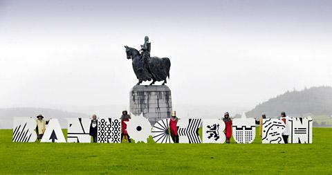
Bright White brought The Beautiful Meme into the project to create the attraction’s brand identity, which is now on show by means of a giant version of the logo on the hill at Stirling Castle.
The new identity reflects the history of the battle, with each letter representing a key element, so they can be used as a whole or individually, said Tom Sharp, creative director at The Beautiful Meme.
The symbol used for the B illustrates the tight packs in which the Scots would group together, known as schiltrons. The men would brandish pikes ready to spear oncoming troops.
The Beautiful Meme also worked with Dalton Maag, the type designers behind the legendary Nokia brand, on a consultancy basis.
Tom said: “We set out to create a visual identity that was both brutal and playful, full of meaning yet instantly accessible, and fresh without eschewing tradition – all the things the visitor centre itself is going to be. Working closely with Bright White meant our brand work was informed at all times by the stunning interactive experience they are creating.”
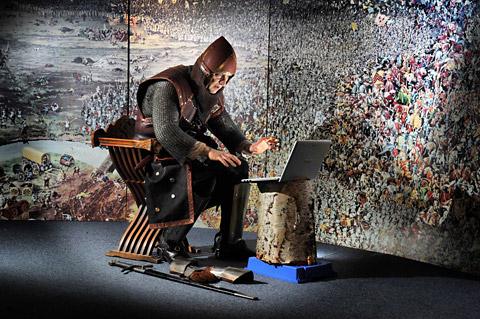
The new visitor centre will feature 3D technology to engage people in an experience which brings the realities of medieval battle to life.


Comments: Our rules
We want our comments to be a lively and valuable part of our community - a place where readers can debate and engage with the most important local issues. The ability to comment on our stories is a privilege, not a right, however, and that privilege may be withdrawn if it is abused or misused.
Please report any comments that break our rules.
Read the rules here